ShopDreamUp AI ArtDreamUp
Deviation Actions


Suggested Deviants


Suggested Collections


You Might Like…


Featured in Groups


Description
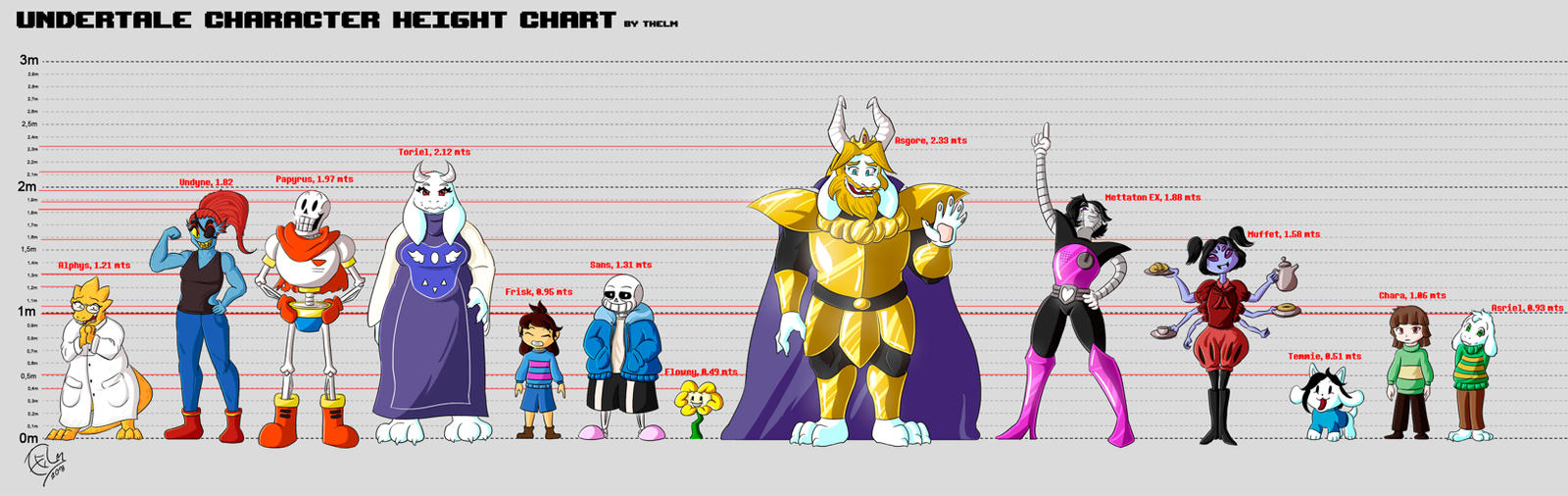
So I finally decided to get things right and drew all Undertale characters in one picture! do you have a favourite carácter? which one is it? do you like how it looks?
This is my versión of the characters from the game, drawn using my style, the idea is for people to get a better idea of how I picture these characters in my head; besides I always like doing things like reference sheets, designs and things of the sort, not to mention this was a good excuse for me to finally try and draw all the Undertale characters as best as I could.
One of the things I like about this game is that it has so many characters and they all look so different it's actually quite challenging to draw them all!
I'm very proud of this picture because it shows to me how much I've improved over time since the very first fanart I did for this game (fanart that I never uploaded because it sucked) I remember having a lot of trouble drawing Alphys and Undyne, Papyrus too! But now I can finally look at my drawing and say that I genuinely like it. (I personaly love how Alphys looks in here tbh)
Also, this is the very first time I draw both Mettaton and Muffet, and I'm amazed at how they turned out! This also includes Chara and Asriel along with Temmie, I never tried to draw them seriously.
There are more characters from the game that I want to portray in my style, so maybe I will do a second part of this, just for fun.
Image size
3535x1117px 1.09 MB
© 2018 - 2024 Thelightsmen
Comments22
Join the community to add your comment. Already a deviant? Log In
Hello ! I'm from projectComment 
I haven't played the video game on which the drawing is based but I already made a comment a few weeks ago about it, so I remember some things that I was looking online at that time. Anyway, I've looked at the characters again in pictures to compare them with the ones you've made.
What stands out most of the image is that it's attractive to see so many characters together. It's something that has always attracted me when an artist has done something similar. Also, doing something of this style requires a lot of patience and time. +1 for you !")
Another thing that I like is the stroke in border lines, the colors and the shading that you have applied. I see everything quite accurate and the reflections of light highlight the armor of Asgore and Mettaton are awesome ! The casted shadows all fall in the same place coinciding in all the characters, so that is another point in favor for the whole illustration.
I also see that you have given a different pose and facial expression to each character, which is appreciated to bring dynamism, variety and personality to each of the members of the image. In that aspect I think you've also made it very well! My favorites are Asriel and Toriel because they have a very natural and attractive poses and expressions
Now I will comment on some things that could perhaps be improved:
- Asgore and Alphys suffer from the same problem, they have a nose or mouth with a flat appearance due to the lack of shadows and reflections. Asgore also has a beard and a little small mouth, resulting in something strange. Perhaps widening the mouth would allow the beard to look more natural.
- Undyne needs more feminine shape. For example, making the waist, the neck and the shape of the head a little thinner and more stylized.
- The appearance of Papyrus is good in general, but it seems that it is located on the ground a little apart from the line where all the others are.
- Frisk, Chara and Flowey have pretty simple designs, so there's not much to say. Nice drawings
- Sans is great, his smile is characteristic and I think it's perfect.
- Mettaton, as I said, has some fantastic reflections on the armor. I also like the details on the chest, the white glow of the heart at the waist, even the pose is great. But in the face it is noted that you had a hard time to made it well the inclined pose. It's normal, because it's a complicated pose. Perhaps the mouth should be moved a little to the left and adjust the rest of the parts. Studying photo references should help (Smile)")
- Muffet in general aspects is well made, but the arms don't match in size and length.
- Temmie is great, but the lower part of the mouth looks a bit forced. In the reference pictures I've seen, there is usually less deviation.
Finally, talking about composition ... why have you placed the characters that way? In my opinion it's great, remembers me to the typical image of criminals posing in a police station Although it would have been interesting to do an alternative version in which the characters were located from the smallest to the highest from left to right for example 
Did you put the height of every character according with your imagination or this was founded somewhere? I've seen several images on internet trying to show something similar to you... and there is variety.
Good luck and keep going!
I haven't played the video game on which the drawing is based but I already made a comment a few weeks ago about it, so I remember some things that I was looking online at that time. Anyway, I've looked at the characters again in pictures to compare them with the ones you've made.
What stands out most of the image is that it's attractive to see so many characters together. It's something that has always attracted me when an artist has done something similar. Also, doing something of this style requires a lot of patience and time. +1 for you !
Another thing that I like is the stroke in border lines, the colors and the shading that you have applied. I see everything quite accurate and the reflections of light highlight the armor of Asgore and Mettaton are awesome ! The casted shadows all fall in the same place coinciding in all the characters, so that is another point in favor for the whole illustration.
I also see that you have given a different pose and facial expression to each character, which is appreciated to bring dynamism, variety and personality to each of the members of the image. In that aspect I think you've also made it very well! My favorites are Asriel and Toriel because they have a very natural and attractive poses and expressions
Now I will comment on some things that could perhaps be improved:
- Asgore and Alphys suffer from the same problem, they have a nose or mouth with a flat appearance due to the lack of shadows and reflections. Asgore also has a beard and a little small mouth, resulting in something strange. Perhaps widening the mouth would allow the beard to look more natural.
- Undyne needs more feminine shape. For example, making the waist, the neck and the shape of the head a little thinner and more stylized.
- The appearance of Papyrus is good in general, but it seems that it is located on the ground a little apart from the line where all the others are.
- Frisk, Chara and Flowey have pretty simple designs, so there's not much to say. Nice drawings
- Sans is great, his smile is characteristic and I think it's perfect.
- Mettaton, as I said, has some fantastic reflections on the armor. I also like the details on the chest, the white glow of the heart at the waist, even the pose is great. But in the face it is noted that you had a hard time to made it well the inclined pose. It's normal, because it's a complicated pose. Perhaps the mouth should be moved a little to the left and adjust the rest of the parts. Studying photo references should help
- Muffet in general aspects is well made, but the arms don't match in size and length.
- Temmie is great, but the lower part of the mouth looks a bit forced. In the reference pictures I've seen, there is usually less deviation.
Finally, talking about composition ... why have you placed the characters that way? In my opinion it's great, remembers me to the typical image of criminals posing in a police station
Did you put the height of every character according with your imagination or this was founded somewhere? I've seen several images on internet trying to show something similar to you... and there is variety.
Good luck and keep going!